


Interlink
Hong Kong Transport Infrastructure Identity
Creating an identity for the world’s largest transport infrastructure project.
The international airport at Kai Tak and the Port of Hong Kong was rapidly becoming too small for the needs of the islands and the region. It was clear that a new, significantly larger infrastructure was required. This had been proposed several times since the 1950s, but had been set aside because of cost, politics, disruption to commerce and the people of Hong Kong. But by the early 1990s it could no longer be ignored.
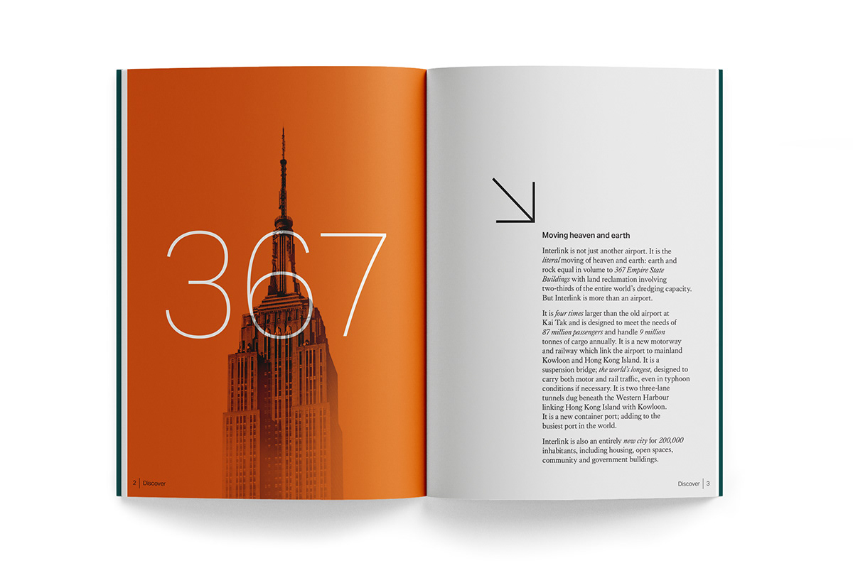
Moving heaven and earth
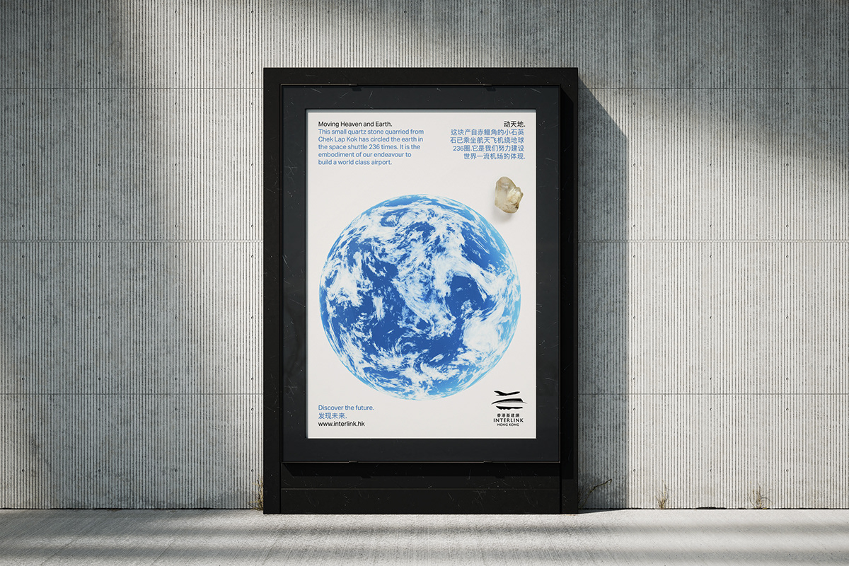
With very little available land the Government of Hong Kong determined to undertake the construction of a new island as part of the largest infrastructure project in the world! The endeavour would entail the literal moving of heaven and earth: earth and rock equal in volume to 367 Empire State Buildings with land reclamation involving two-thirds of the entire world’s dredging capability.

Local knowledge, international experience
The Hong Kong Government appointed a combined team of consultants; Alan Chan and Springpoint to create an identity program for the project which would capture the imagination of people locally and internationally. Alan Chan, as a Hong Kong based agency had the necessary local cultural knowledge and Springpoint offered international branding expertise and perspective. The team would established a consistent project image which would promote the scale of the project, its grandeur, audacity and especially the benefits it would bring to the region and Hong Kong.


Guiding the way people feel
Springpoint conducted research to establish the needs and aspirations of people living in Hong Kong and South China as well as the attitudes of the international community. Based on this understanding Springpoint developed a communication and design strategy, which expressed the spirit of Hong Kong in general and of the infrastructure project in particular. The key strategic thought, or positioning, was summed up by the word ‘Interlink’ as the project links islands together and to mainland South China; and ultimately to the rest of the world. Metaphorically the project links generations, economic centres, cultures, nations and ideology.

From one symbol, an entire language
The new infrastructure identity adds up to an unmistakable and unique visual language which makes it possible to adopt different tones of voice whilst maintaining a consistent visual approach. A flexible, cohesive corporate language makes it possible to target different people whilst saying subtly different things in the same voice. Springpoint mapped out a Narrow Targeting Strategy to identify key target groups, their attitudes, aspirations and needs; and the most appropriate medium, message and tone of voice for each communication.


Touching everyone in Hong Kong
A project on a scale this vast cannot help but touch the lives of thousands of people living and working in Hong Kong; everyone from school children to civil servants, restaurateurs to entrepreneurs, manicurists to industrialists. As such, it was essential to inform the people of Hong Kong and the world about the scale and implications of the work, progress reports, and how the completed project will benefit everyone. In the earliest stages of planning the Hong Kong Government took steps to ensure everyone was well informed.


Interlink brand elements
It was essential we understood the cultural significance of symbols and images when talking to local or international communities. so the Interlink brand elements were carefully created; including symbolism, colour palette and font selection.
We developed a clear, strategically focussed design brief which would ensure the brand marque would communicate and not merely decorate. The marque was designed to be a meaningful, relevant and distinctive, representing the spirit as well as the letter of the project. It was not just a good idea, but a useful idea and an idea that could be readily assimilated and have meaning and significance for a great number of people with different points of view and different languages, cultures, hopes, ambitions and beliefs.


Immediacy and simplicity
The adopted concept was chosen for its immediacy and simplicity. The three brush-strokes represent the ideas of takeoff, ascent and flight, of land-speed and swift water-crossing. The idea communicated a clear sense of direction, mobility and momentum with the calligraphic style creating a contemporary, readily understood marque with classical Chinese associations. The logo was also reminiscent of the Chinese symbol for the numeral ‘three’ thus placing the transport infrastructure into the context of a trinity of air, land and ocean travel.


To the future of Hong Kong
The Interlink branding united the people of Hong Kong behind the world’s biggest infrastructure project successfully engaging both local and international interest.


Acknowledgements
If any team members have been
omitted please click this link
and email the new details.
Project Date
1995
Design
Mark Pearce
Gary Broadbent
Justin Banks
Strategy
Fiona Gilmore
Vanessa Lumby
Fenella McCarthy
Production
Dennis Furniss
Aubrey Hastings-Smith ( - 2006)
West One Arts

Thank you!
Your likes and comments
are much appreciated.
This case history was designed and
published by Gary Broadbent who
was a creative director and designer at
Springpoint between 1990 and 2002.
Gary lives and works in Australia
with his branding agency Propella.
For all project enquiries please


